The admin tool used by implementations, compliance, and support teams had never been prioritized from a design perspective, and the team had a litany of complaints about its efficiency. I was tasked with finding a way to design impactful improvements that could be implemented quickly.
Timeline: July-Sept 2019
Platforms: Web admin app
Team: Product Designer (me), Product Manager, 4 Engineers
Results
Brightwell is a company that provides financial services for cross-border remittance and, at the time, focused on the cruise industry. They help cruise ship companies pay their international workers by handling payroll and remittance through their system.
Throughout my time at Brightwell, I was a Product Design team of one embedded in the Product team, responsible for the product website, mobile apps, and Admin tool. I was also responsible for user research and cross-company collaboration.
This particular project was an update to the admin tool: the tool that allowed Support, Compliance, Implementations, IT team members and more to act on the system supporting the payroll. In addition, some of the paymasters on ships had access to the system of the employees on their ship.
The Admin tool had many issues and was a constant source of complaint, but they were rarely addressed. With this project, our task was to figure out what changes we could implement quickly (about 2 developer sprints) that could have maximum impact.
We conducted interviews with internal coworkers, grouping them according to their team. We interviewed 2-4 team members at a time to investigate their issues with the system. We talked to:
- the Customer Support team
- the Compliance team (legal)
- the Implementation team (who went on ships to help users enroll)
- DevOps and IT
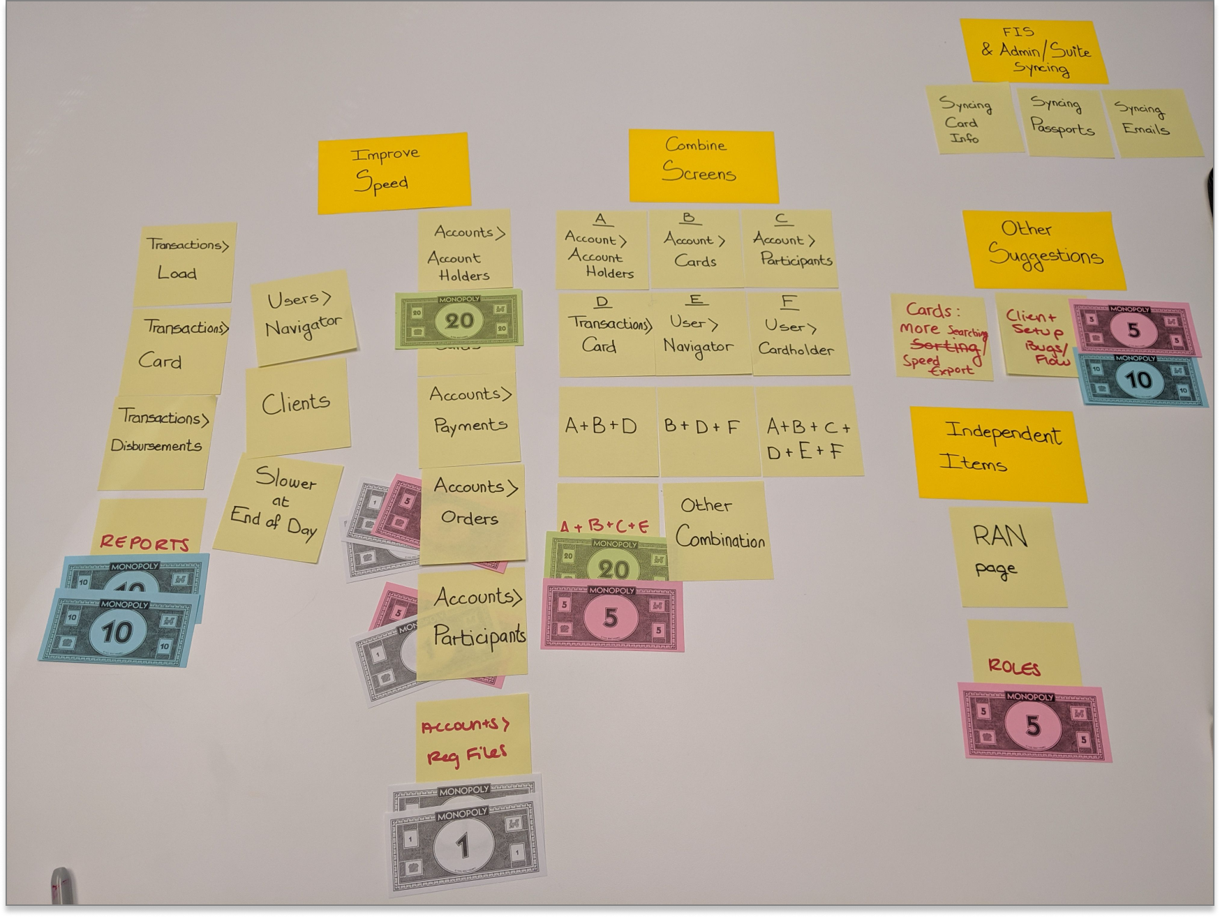
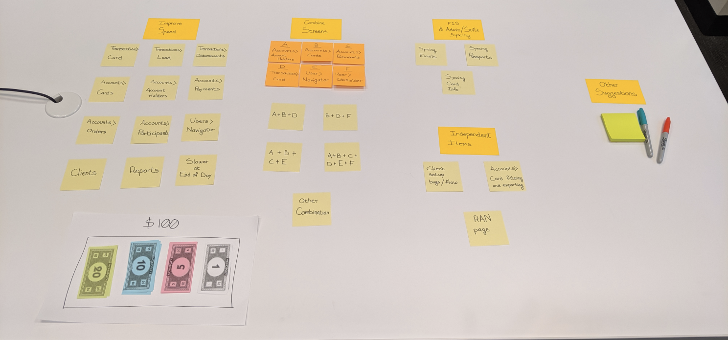
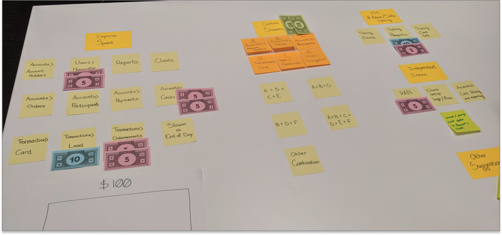
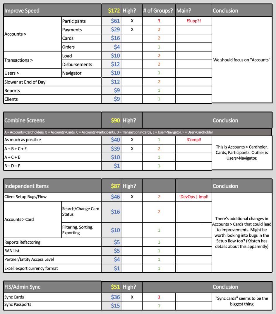
Through affinity mapping, we identified a list of important problems teams cared about. The list was abundant, and we needed further help understanding where the pain points really were. So we conducted a second round prioritization exercise with the teams:
What were our findings?
We laid each "Improvement" on a post-it note, and provided each team with $100 to "spend" across
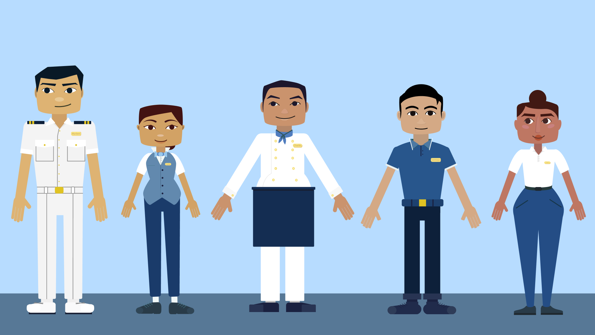
Internal users, + some ship users - describe more.
There is a large variation in their English proficiency, and they spend most of the time on ships in the middle of the ocean - they often have no phone access and can’t just get services off the street when they need them.
-weffawe
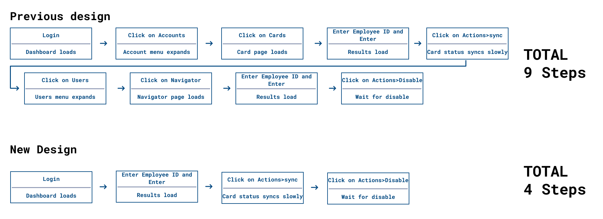
We were going to create a new "landing page" for the Admin application. Previously the screens users saw upon log-in was completely underutilize. Instead, we were going to use this space to consolidate important information, providing an intuitive location for most users to gather the information they need.
Ideation, feedback from devs
prototyping, and
early testing , results out outcomes
User testing and results
Refinement
Final designs
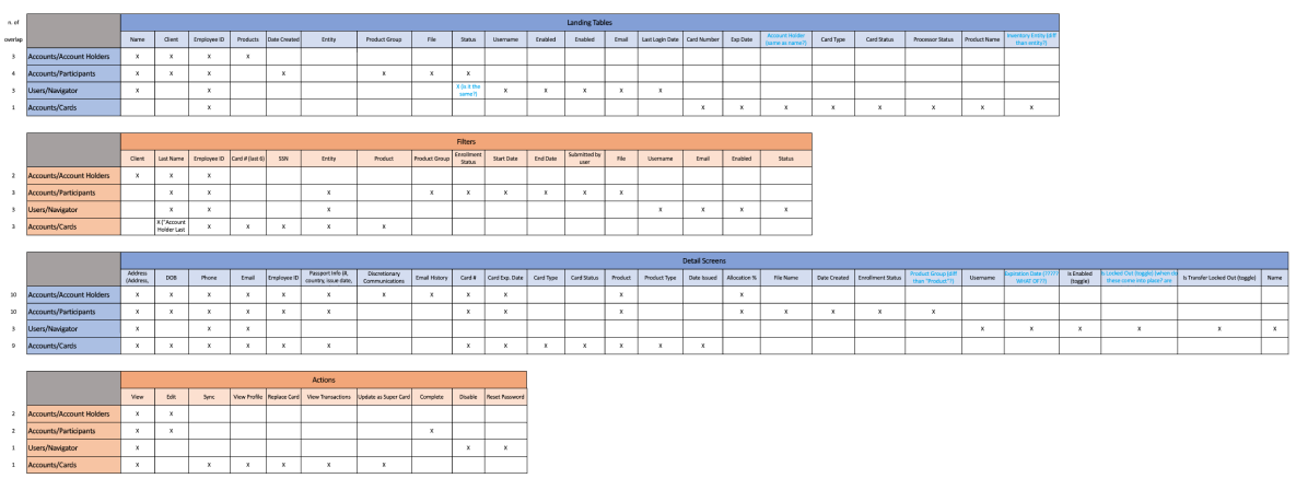
I went through each screen to combine and inventoried the information present on each of them. A lot of it was repetitive, showing why it made so much sense to combine them.
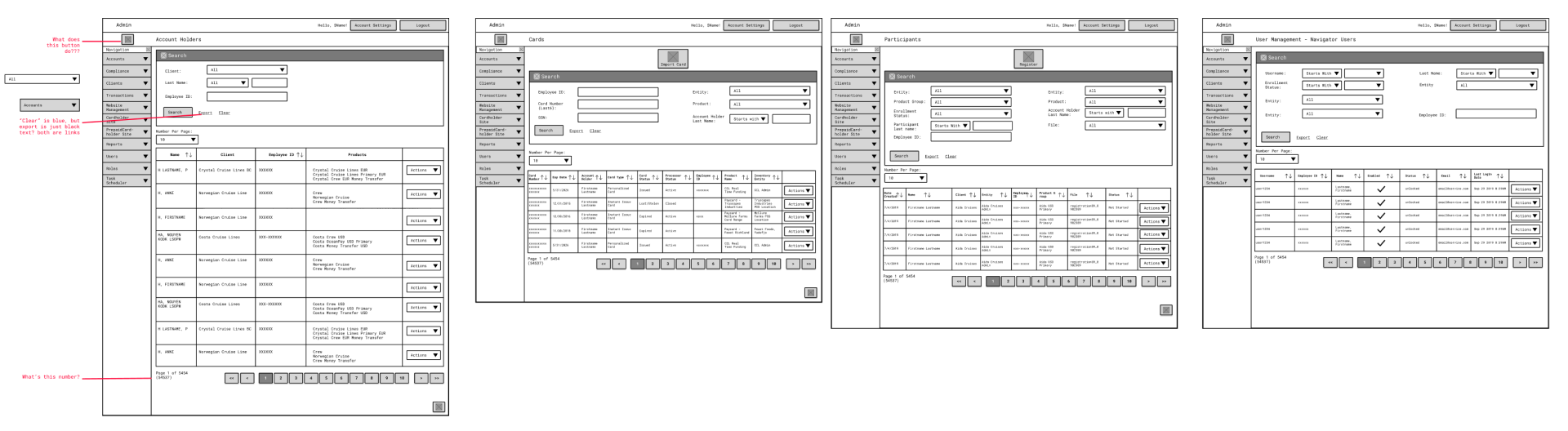
Low fidelity wireframes were used to discuss, test and validate early iteration of our solution. This led to quite a lot of modifications: from a division into 2 separate tabs to query different sections of the database and conduct faster searches, to various iterations of the information displayed to users.
Low fidelity wireframes were used to discuss, test and validate early iteration of our solution. This led to quite a lot of modifications: from a division into 2 separate tabs to query different sections of the database and conduct faster searches, to various iterations of the information displayed to users.